Table of Contents
- Why Small Rooms Feel Tight (And How Tiles Help)
- How Printed Tiles for Small Rooms Influence Visual Space Perception
- Best Printed Tile Design Strategies for Small Rooms
- What Type of Tiles Make a Small Room Look Bigger?
- Do Patterned Tiles Make a Room Look Smaller?
- What Size Tiles Make a Small Room Look Bigger?
- Understanding the 3‑4‑5 Rule in Tile Layout
- Best Printed Tiles for Small Rooms (By Surface)
- Expert Design Tips for Space‑Enhancing Interiors
- Common Mistakes to Avoid with Printed Tiles for Small Rooms
- Practical Example: Before vs After Room Perception
- Conclusion
Yes, printed tiles can make small rooms look bigger—when you choose light colours, reflective finishes, and large-format patterns. Horizontal stripe designs expand width, diagonal layouts create depth, and minimal grout lines reduce visual clutter. The key is optical illusion, not structural change.
I’ve seen tiny bathrooms transform from cramped to airy simply by swapping dark, busy tiles for light, glossy, continuous designs. At ArtPlus, we’ve helped Dubai homeowners achieve the same results with custom printed tiles. This guide explains exactly how printed tiles influence visual perception—and gives you actionable strategies to make any small room feel more spacious.
Why Small Rooms Feel Tight (And How Tiles Help)
Small rooms feel constricted because our eyes hit visual barriers—corners, contrasting colours, and broken surfaces. Printed tiles can redirect that visual flow. By controlling pattern direction, reflection, and colour continuity, you create the illusion of depth and openness. This isn’t magic; it’s design psychology. For professional ceramic tile printing in Dubai that offers custom colours, finishes, and large-format sizes, work with an experienced studio.
How Printed Tiles for Small Rooms Influence Visual Space Perception
The Psychology Behind Ceramic Tile Visual Depth
Your brain interprets lines, patterns, and symmetry as spatial cues. When tiles have consistent, flowing patterns, your eye moves smoothly across the surface—making the room feel larger. Repetitive lines (horizontal or vertical) guide the gaze outward, tricking the brain into perceiving extra space. Learn how digital printed ceramic tiles for interiors improve design flexibility and colour accuracy for any room size.
Role of Reflective Surfaces in Space‑Enhancing Interiors
Glossy finishes bounce light, doubling the visual depth. A glossy tile opposite a window can reflect the outside view, effectively extending the room. Matte finishes absorb light, which can make small rooms feel flatter. For small spaces, choose glossy or semi-gloss finishes.
When Printed Tiles Actually Reduce Perceived Space
- Overly busy designs with high contrast
- Dark tones that absorb light (dark charcoal, black, deep navy)
- Mixed patterns that create visual chaos
- Small, cluttered repeating patterns (like tiny mosaics)
Best Printed Tile Design Strategies for Small Rooms
Follow these actionable strategies to maximize visual space.
Tile Designs for Small Bathrooms That Create Openness
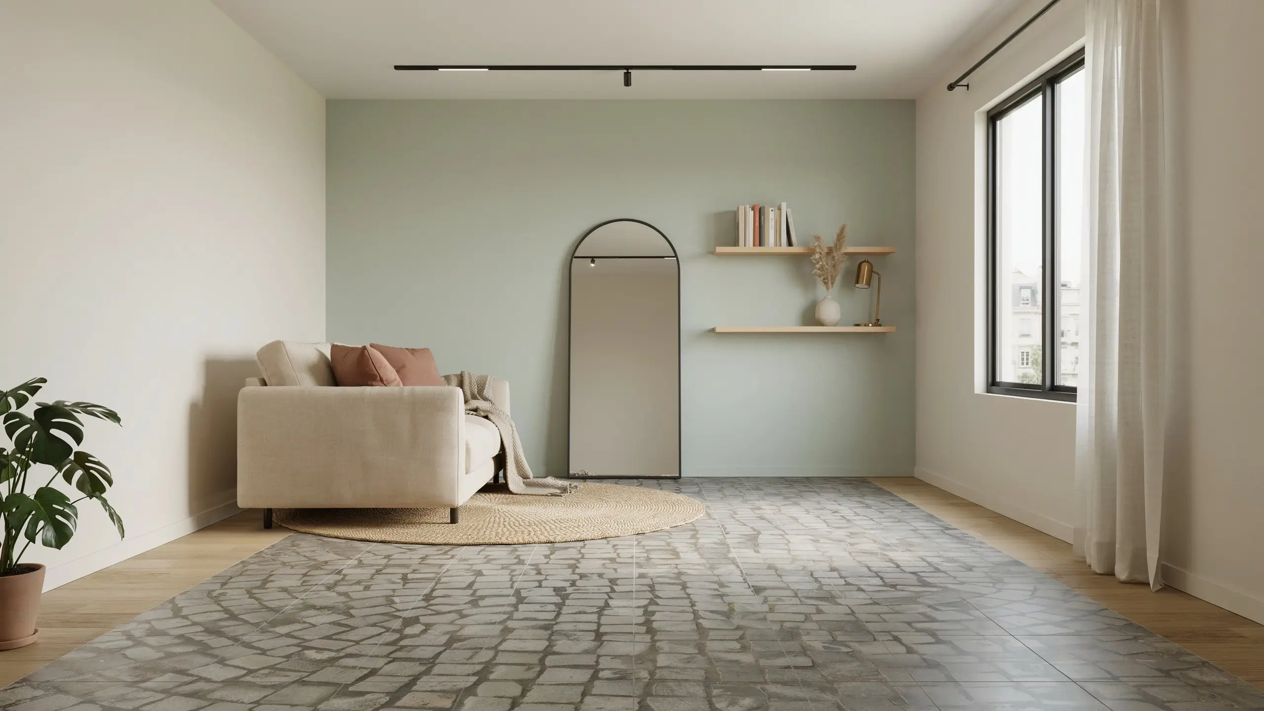
- Light marble‑inspired prints – soft white, cream, or pale grey veins
- Soft neutral tones – beige, taupe, warm sand
- Continuous wall‑floor visual flow—use the same tile on walls and floor to eliminate visual breaks
For more luxury inspiration, explore the latest ceramic tile design trends for UAE interiors.
Wall Tile Patterns for Small Spaces That Expand Width
- Horizontal stripe patterns: draw the eye side to side, making the room feel wider
- Linear geometric prints: thin parallel lines, preferably in subtle contrast
- Subtle wave designs: create gentle motion without visual noise
Floor Tile Layout Tricks for Visual Room Expansion
- Diagonal placement: laying tiles at 45° tricks the eye into seeing more depth
- Large uninterrupted tile surfaces: fewer grout lines = cleaner visual field
- Minimal grout contrast: match grout colour to tile colour for a seamless look
Ready to Transform Your Small Room with Printed Tiles?
Choose from light marble, soft neutrals, or custom prints. Get a free design consultation and sample. Fast UAE delivery.
Get a Tile QuoteWhat Type of Tiles Make a Small Room Look Bigger?
Light‑Colored Tiles vs Dark Tiles
Light colors reflect more light, which expands the perceived space. White, cream, pale grey, and soft beige are ideal. Dark tiles absorb light and make walls feel closer—use only on a single accent wall, never all four.
Large Pattern Tiles vs Small Pattern Tiles
Contrary to intuition, large-format tiles (30×60 cm, 60×60 cm) often work better than small ones. Fewer grout lines create a continuous surface. Oversized prints (e.g., one large marble vein across multiple tiles) are more spacious‑feeling than tiny, busy mosaics.
Glossy vs Matte Finishes for Small Rooms
Glossy finishes win for space expansion – they reflect light and add depth. Matte finishes are softer and hide smudges but don’t offer the same illusion. Use gloss on walls and floors, or at least on one main surface.
Do Patterned Tiles Make a Room Look Smaller?
Does patterned tile make a room look smaller? Only if the pattern is too busy, high‑contrast, or random. Controlled, minimal patterns (soft waves, fine lines, low‑contrast marble) can actually help by guiding the eye.
When Patterned Tiles Help Small Spaces
- Minimalist patterns with low colour contrast
- Directional patterns that guide vision horizontally or vertically
When Patterned Tiles Hurt Visual Space
- High‑contrast, busy designs (black-and-white geometric, patchwork)
- Multiple patterns mixed in one room
- Random, chaotic decorative overload
What Size Tiles Make a Small Room Look Bigger?
Why Larger Tiles Often Work Better
Fewer grout lines mean fewer visual interruptions. A 60x60cm tile on a small bathroom floor creates a more continuous surface than 10x10cm mosaics. The eye glides across, perceiving more space.
When Small Tiles Still Make Sense
- Shower floors (for slip resistance and drainage)
- Accent strips or borders
- Texture‑based zones (e.g., a feature niche)
Understanding the 3‑4‑5 Rule in Tile Layout
What is the 3‑4‑5 rule for tile? It’s a geometric method to ensure perfect right angles. Measure 3 units along one wall, 4 along the adjacent wall, and the diagonal between them should be 5 units. If not, your walls aren’t square.
Why It Matters in Small Rooms
In small spaces, even slight misalignment distorts patterns and breaks visual symmetry – ruining the expansion illusion. Always check squareness before laying printed tiles.
Best Printed Tiles for Small Rooms (By Surface)
| Surface | Recommended Tile | Why |
| Bathroom walls | Glossy ceramic, light marble print | Reflects light, feels clean and open |
| Bathroom floors | Matte or textured, light neutral | Slip‑resistant but visually light |
| Living room walls | Vertical linear prints | Draws eye upward, increases height perception |
| Floors | Large‑format, minimal pattern, diagonal layout | Continuous surface, depth illusion |
Expert Design Tips for Space‑Enhancing Interiors
- Keep visual continuity across surfaces: Use the same or very similar tiles on walls and floors. Avoid abrupt changes.
- Use light reflection strategically: Place glossy tiles opposite windows or light sources. Add LED strips under cabinets to bounce light off tile surfaces.
- Stick to one dominant design direction: Either horizontal (to widen) or vertical (to heighten). Don’t mix both in the same room.
Common Mistakes to Avoid with Printed Tiles for Small Rooms
| Mistake | Why It Hurts | Fix |
| Overusing bold designs | Visual clutter, feels smaller | Limit bold to one accent wall |
| Mixing multiple tile themes | Chaotic, no flow | Stick to one collection |
| Ignoring lighting conditions | Dark areas feel even tighter | Add mirrors or extra lighting |
| Too many colour contrasts | Breaks visual continuity | Use monochromatic or analogous palettes |
| Excessive grout visibility | Creates a grid pattern and feels boxy | Use color‑matched grout |
Practical Example: Before vs After Room Perception
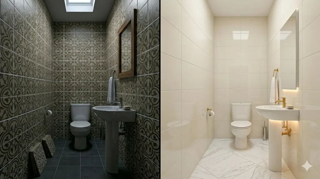
Scenario: A 2.5m x 2m bathroom with no windows, only a skylight.
Before: Dark grey matte floor tiles (30×30 cm), beige wall tiles with a random pattern, and white grout creating a busy grid. The room felt cramped and dark.
After: Same bathroom, but with:
- Light cream glossy wall tiles (60x30cm laid horizontally)
- Large white marble‑print floor tiles (60×60 cm laid diagonally)
- Grout matched to tile colour
- Soft LED strip under the vanity
The room now feels 30% larger. The horizontal wall tiles visually widen the space, the glossy surface bounces skylight, and the diagonal floor layout adds depth – all without moving a single wall.
In a small room, every grout line is a visual barrier. Match your grout to your tile, and those barriers disappear.
Glossy tiles don’t just shine – they steal space from the void and give it to your eyes.
Conclusion
Printed tiles are a powerful tool for making small rooms look bigger – but only when you apply the right strategies. Choose light colours, glossy finishes, and large‑format layouts. Use horizontal patterns to widen, diagonal floors to add depth, and colour‑matched grout to eliminate visual breaks. Avoid busy, high‑contrast designs. With these techniques, your small bathroom, powder room, or narrow hallway can feel surprisingly spacious—no demolition required. Explore digital tile printing in the UAE to create custom‑sized, light‑reflective tiles tailored to your small space.
Ready to Transform Your Small Room with Printed Tiles?
Choose from light marble, soft neutrals, or custom prints. Get a free design consultation and sample. Fast UAE delivery.
Get a Tile QuoteFAQs
Only if the pattern is too busy or high‑contrast. Controlled, low‑contrast patterns (soft marble veins, fine lines) can actually expand visual space.
Light‑coloured, glossy or semi‑gloss ceramic tiles with minimal patterns. Large‑format tiles (60x60cm or 30x60cm) with matching grout work best.
Medium to large tiles – typically 30x60cm, 60x60cm, or even larger. Fewer grout lines create a cleaner, more continuous surface.
A layout method to ensure perfect right angles. Measure 3 units along one wall, 4 along the adjacent, then the diagonal should be 5. Used to prevent uneven pattern distortion.
Only as a single accent wall, never on all four walls or the floor. Dark colours absorb light and make spaces feel tighter.
Horizontal lines make the room feel wider. Vertical lines make the ceiling feel higher. Choose based on your room’s proportions.

