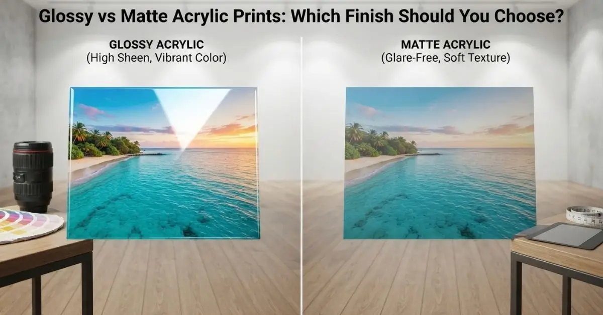
Glossy acrylic gives photos stronger reflections, deeper visual contrast, and a glass-like appearance, while matte acrylic offers softer reflections and a more subdued look. The right choice depends mainly on your room lighting, viewing angle, image style, and the atmosphere you want to create.
If you’re comparing glossy vs matte acrylic prints, don’t choose the finish based only on how it looks in a product photo. The same print can look very different in a bright room, under spotlights, or beside a large window.
The practical rule is simple: choose glossy when you want visual impact and rich surface depth; choose matte when reflection control and comfortable viewing matter more.
Glossy and Matte Acrylic Prints: What Is the Difference?
The main difference is how the acrylic surface interacts with light.
A glossy finish has a smoother, more reflective surface. It can make colors appear more vivid and give photographs a clean, glass-like presentation. This is one reason glossy acrylic is often used for contemporary photography and statement wall art.
A matte finish reduces surface reflection and creates a softer appearance. It can make a print easier to view when there are strong lights, windows, or other reflective surfaces nearby.
Neither finish is automatically better. The better option depends on where the artwork will be displayed.
When Glossy Acrylic Prints Make More Sense
Glossy acrylic is a natural fit when you want the artwork to attract attention.
The smooth surface works particularly well with photographs containing strong colors, deep blacks, highlights, or fine detail. Landscape photography, cityscapes, portraits, abstract artwork, and colorful artwork can all benefit from the extra visual intensity of a glossy surface.
Choose glossy acrylic when:
- The room has controlled or moderate lighting.
- You want a modern, glass-like appearance.
- The artwork contains vibrant colors or strong contrast.
- The print will be viewed mostly from a relatively direct angle.
- You want the artwork itself to become a visual focal point.
For example, a colorful photographic print above a sofa can work particularly well with a glossy finish when the wall is away from direct sunlight and strong ceiling lights.
ArtPlus offers custom acrylic printing in Dubai for photographic artwork, wall décor, and other custom applications. Its acrylic printing service uses UV printing technology and is designed for contemporary interior displays.
When Matte Acrylic Is the Better Fit
Matte acrylic is worth considering when controlling reflections is more important than maximizing surface shine.
A matte surface creates a quieter presentation. This can be useful in offices, galleries, bedrooms, reading areas, and other spaces where people may view artwork from different positions.
Choose matte acrylic when:
- The artwork is near a window.
- Ceiling lights create noticeable reflections.
- People will view the print from several angles.
- You prefer a softer, understated appearance.
- The room already contains many glossy or reflective surfaces.
Matte acrylic photo prints can also work well when the image itself is the main focus and you don’t want the surface to compete for attention.
How Room Lighting Should Influence Your Choice
Lighting is probably the most overlooked factor when choosing between acrylic print finishes.
A finish that looks perfect in a showroom can behave differently once it is mounted in your home, office, hotel, or gallery.
Bright rooms with large windows
If sunlight enters the room directly or changes significantly throughout the day, reflections can become more noticeable on glossy acrylic.
In this situation, matte can provide better reflection control, especially when the artwork is positioned opposite a window.
Rooms with spotlights
Spotlights can create concentrated reflections on glossy surfaces. If the lighting is carefully positioned, this can create an attractive highlight. If it points directly toward the artwork, however, it may interfere with viewing.
For a gallery-style display, consider the artwork and lighting together rather than choosing the finish first.
Low-light or controlled interiors
Glossy acrylic can be particularly effective when the surrounding lighting is controlled.
A darker room with carefully positioned accent lighting can emphasize the depth, contrast, and reflective quality of a glossy print without producing distracting glare.
The finish should be selected with the lighting plan, not separately from it.
Glossy vs Matte Acrylic Prints for Different Interior Styles
Your interior style also matters.
Modern and contemporary interiors: Glossy acrylic often complements polished furniture, glass, metal, and other clean modern surfaces.
Minimalist interiors: Matte can provide a quieter appearance, particularly when the room already has several visual elements.
Luxury interiors: Either can work. Glossy can create a polished statement, while matte can provide a more refined and restrained presentation.
Office and commercial interiors: Consider viewing angles and lighting first. If people move around the artwork frequently, reflection control can become more important.
Bedrooms and relaxed spaces: Matte can create a softer visual effect, while glossy works when you deliberately want the artwork to stand out.
There is no single rule for every interior. The surrounding materials, wall color, lighting, and artwork should all be considered together.
How the Image Itself Affects the Finish
Don’t overlook the image.
A finish should support the photograph or artwork rather than fighting against it.
Bright and colorful photography
Glossy acrylic can complement images with saturated colors and strong contrast. The reflective surface can contribute to the crisp, contemporary character of the display.
Black-and-white photography
Both finishes can work well. Glossy can emphasize contrast and highlights, while matte can create a more restrained, gallery-like presentation.
Portraits
Think about skin tones, highlights, and the viewing environment. If the print will sit beneath direct lights, excessive reflections can become distracting.
Artwork with subtle textures
Matte can be useful when you want viewers to focus on the artwork without strong surface reflections competing with delicate details.
High-contrast modern artwork
Glossy can reinforce a bold visual style, especially when the surrounding lighting is controlled.
A Simple Way to Choose the Right Acrylic Finish
If you’re still unsure, use this four-question test:
1. Where will the print hang?
Identify the wall, viewing distance, and whether people will see it from different angles.
2. What light hits that wall?
Check windows, ceiling lights, lamps, and spotlights at different times of day.
3. What does the artwork need?
Consider color, contrast, highlights, texture, and overall visual character.
4. What should the room feel like?
Choose glossy for a more polished, high-impact surface or matte for a softer, lower-reflection presentation.
This approach is more reliable than choosing a finish simply because one looks better on a screen.
A Practical Example: Living Room vs Office
Imagine two identical landscape photographs.
In a living room with controlled lighting and no window directly opposite the artwork, glossy acrylic may help the image become a strong focal point.
Now place the same photograph in an office with a large window behind the viewer and overhead lights aimed toward the wall. The glossy surface may produce distracting reflections. A matte finish may be more comfortable for people viewing the print throughout the day.
The image hasn’t changed. The environment has. That’s why the room should influence the finish.
Consider Display Lighting Before Finalizing Your Print
Acrylic is particularly sensitive to how light interacts with its surface.
Before production, look at where your main light sources are located. If possible, stand where the artwork will be viewed and check whether a window, pendant light, or spotlight falls within your normal line of sight.
For commercial projects, this matters even more. A hotel lobby, retail display, office reception area, and private residence can have completely different lighting conditions.
If you’re working on a larger interior project, ArtPlus also provides custom glass printing solutions and other material options for decorative and commercial applications.
Acrylic Finish vs Framing: Think About the Whole Display
The finish isn’t the only visual decision.
If you’re placing acrylic artwork inside a larger gallery wall, consider the frame or mounting style, neighboring artwork, wall color, and lighting at the same time.
For projects that combine printed artwork with traditional framed pieces, professional custom framing services in Dubai can help coordinate the final presentation.
The goal is not simply to select an attractive print. It is to create a display that looks intentional once everything is installed.
Glossy vs Matte Acrylic: Quick Comparison
| Factor | Glossy Acrylic | Matte Acrylic |
| Surface appearance | Smooth and reflective | Soft and low-reflection |
| Visual impact | Strong, polished look | Subtle, understated look |
| Reflection control | Lower | Higher |
| Bright rooms | May show more reflections | Generally easier to view |
| Controlled lighting | Excellent fit | Also suitable |
| Vibrant photography | Strong option | Good option |
| Minimal interiors | Can create a statement | Can blend more quietly |
| Offices/galleries | Depends on lighting | Useful where glare is a concern |
| Best starting point | Impact and visual depth | Comfort and reflection control |
The table is a starting point, not a substitute for seeing the artwork in its actual environment.
Common Mistakes When Choosing Acrylic Print Finishes
Choosing based only on an online product photo
Screens don’t reproduce the physical interaction between acrylic and room lighting. Always consider the actual display environment.
Ignoring windows
A window opposite or beside the artwork can dramatically change how a reflective surface looks during the day.
Using strong spotlights without considering glare
Accent lighting can enhance artwork, but its position matters. Direct reflections can distract from the image.
Choosing the finish before choosing the location
The wall should be considered first. Once you understand the lighting and viewing conditions, the finish becomes easier to select.
Assuming glossy always means better color
Color appearance depends on the image, printing process, material, lighting, and viewing conditions. Finish alone does not determine overall print quality.
Final Takeaway
When choosing between glossy and matte acrylic, start with the room rather than the finish.
Look at the lighting, viewing angles, artwork, wall position, and overall interior style. Glossy is a strong choice when you want a polished, high-impact display in controlled lighting; matte makes more sense when reducing reflections and creating a quieter presentation are priorities.
For a professional acrylic display, the best finish is the one that allows the artwork to look right where it will actually be viewed.
Frequently Asked Questions
Is matte or glossy better for acrylic painting?
It depends on the artwork and display environment. Glossy can emphasize color and contrast, while matte can reduce reflections and provide a softer presentation.
Is matte or glossy finish better for prints?
Neither is universally better. Glossy is often suitable for vibrant, high-impact displays, while matte can be preferable when reflection control and comfortable viewing are priorities.
Which finish is better, glossy or matte?
Choose glossy when you want a polished, reflective appearance and have controlled lighting. Choose matte when the artwork is exposed to windows, spotlights, or multiple viewing angles.
Which is better for photo prints, matte or gloss?
For photo prints, consider both the image and its location. Glossy can suit colorful, high-contrast photography, while matte can work well for photographs displayed in bright or reflective environments.
Is glossy acrylic suitable for wall art?
Yes. Glossy acrylic is commonly used for contemporary wall art because its smooth surface creates a clean, glass-like presentation. The surrounding lighting should be considered before installation.
Can lighting change how an acrylic print looks?
Yes. Windows, ceiling lights, spotlights, and viewing angles can change the amount of reflection visible on the surface. This is why lighting should be considered when selecting the finish.